Creating and Editing a Step
Creating a Step
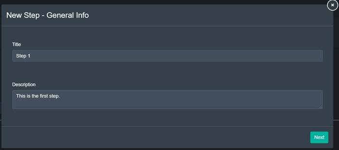
By clicking the green ‘Add Step’ button on the top middle of the page, the user can create an entirely new step.
With the green ‘Next’ button in the bottom right corner, the user may continue creating the step.
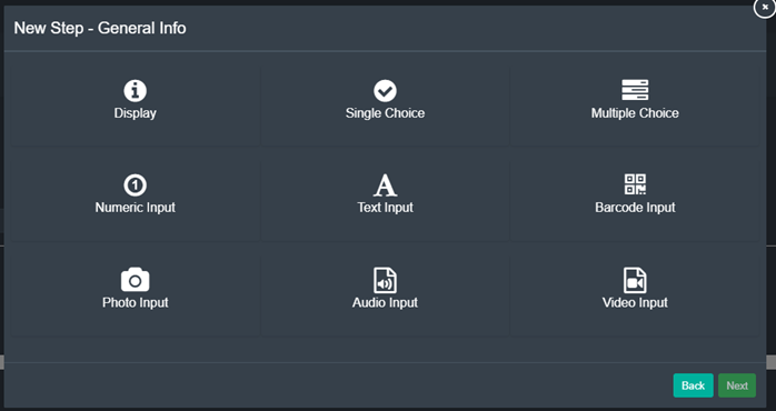
Should the user have clicked the ‘Next’ button, he is presented with the pop-up depicted above. Here, the user can select the type of input that will be required by the person working on the step. More information on the type of steps can be found here.
Further, the user can specify if the step is optional or not with the drop-down menu at the bottom of the pop-up.
With the two green buttons on the bottom right, the user can choose to either go back to the previous pop-up screen with the ‘Back’ button (left) or continue with the ‘Next’ button (right) after having selected a type of step.
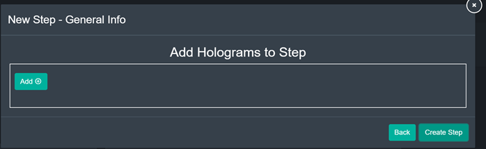
After having filled out all step-specific instructions, the user is presented with the pop-up depicted above.
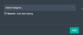
Here, the user can add informational holograms to a step with the green ‘Add’ button in the middle section of the pop-up. A second pop-up window will appear prompting the user to search for a hologram by name from the data base, after which he can add it by clicking the green ‘Add’ button in the bottom right corner.
With the two green buttons on the bottom right, the user can choose to either go back to the previous pop-up screen with the ‘Back’ button (left) or continue with the ‘Create Step’ button (right), which will save the changes and close the pop-up.
In order to designate the order in which steps have to be worked through, a step has to be edited by double-clicking on the corresponding step and the specifying the succeeding step.
Editing Steps
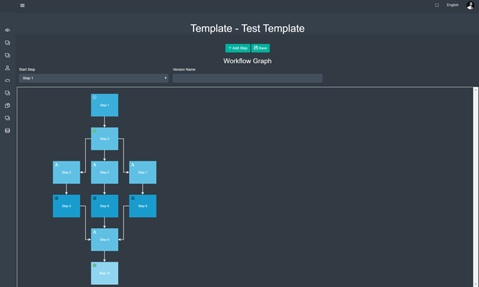
After selecting ‘Edit Steps from the dropdown of the ‘More’ button, the user is presented with a screen that may look similar to the one depicted above – the exact display will vary based on the workflow that was selected.
With the two green buttons on the top middle of the page, the user may add a new step (left button) or save the changes made (right button).
Below the buttons, the user may select the step the workflow starts with, as well as set a version name.
Individual steps may be edited by double-clicking on the step the user wishes to edit, after which a pop-up appears:
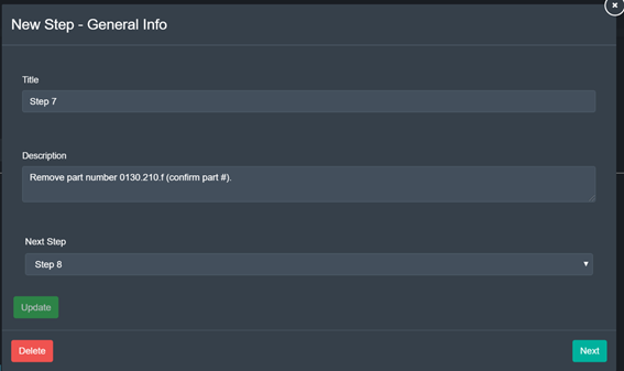
First, the user may change the step’s title, description as well as designate the step following it. After any changes have been made here, the user has the choice to click the green ‘Update’ button in the upper bottom left in order to close the pop-up and save the changes.
With the red ‘Delete’ button in the bottom left corner, the user may delete the step entirely.
With the green ‘Next’ button in the bottom right corner, the user may continue making changes to the step.
From here on out, editing a step works analogous to creating a step.
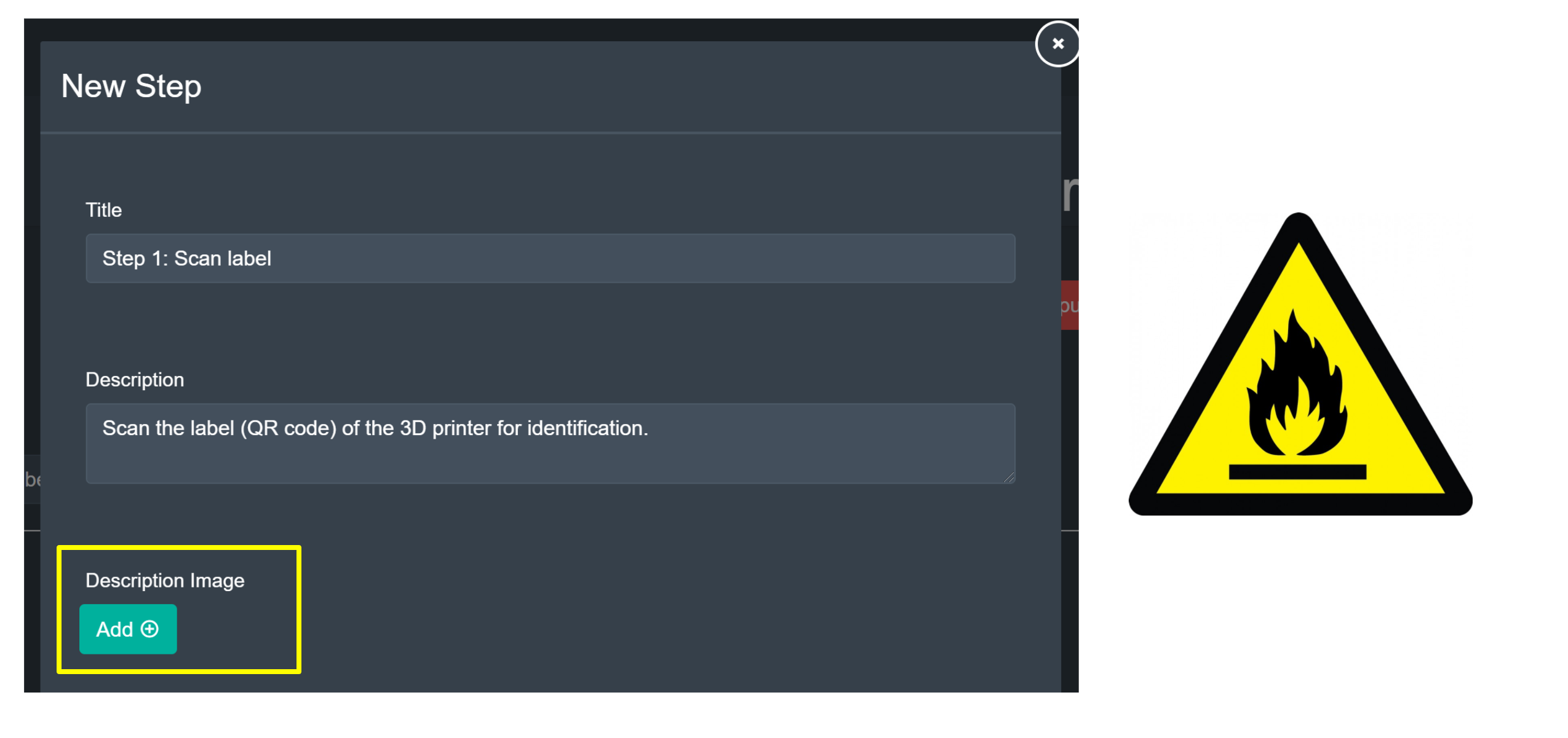
Step description images
When creating or modifying a step, an optional description image can be attached in order to mark it in a significant way. For example, you may want to call attention to a step that has a significant fire hazard, by attaching a caution image similar to the example shown below.
On application clients, this description image will show up on the step panel user interface accordingly.